For most outdoor spaces, a medium-toned neutral like warm gray, taupe, or a natural wood tone is the safest bet: it stays cooler than black in direct sun, hides dirt and wear better than white or cream, and plays nicely with almost any flooring, brick, or landscaping palette. If you have a heavily shaded space or prioritize a sleek modern look, dark charcoal or black works well. If your patio gets brutal afternoon sun, go lighter. That's the quick framework, but the details below will help you lock in the right call for your specific space.
What Color Patio Furniture Should I Get Today? A Guide

Theo Tierney
2 Jun 2026
How patio furniture color affects heat, fading, and upkeep
Color is not just an aesthetic decision outdoors. It directly affects how hot your furniture gets, how long the finish holds up, and how much cleaning you're doing every season.
The heat factor is real. Light-colored surfaces reflect significantly more solar energy than dark ones. Research from the Lawrence Berkeley National Laboratory's Heat Island Group confirms that highly reflective light surfaces absorb far less solar energy, and DOE data shows light-colored materials can reflect 55% to 90% of incoming sunlight compared to much lower rates for dark finishes. In practical terms: a black aluminum chair sitting in afternoon Arizona or Florida sun can get hot enough to burn bare skin. Some powder-coating manufacturers, like Axalta, have developed 'cool' coating formulations that reduce surface temperature up to 20% by boosting reflectance, but standard black or dark brown finishes have no such benefit. If you're buying furniture that will sit in full sun all day, dark colors make seating genuinely uncomfortable and can warp or stress certain materials over time.
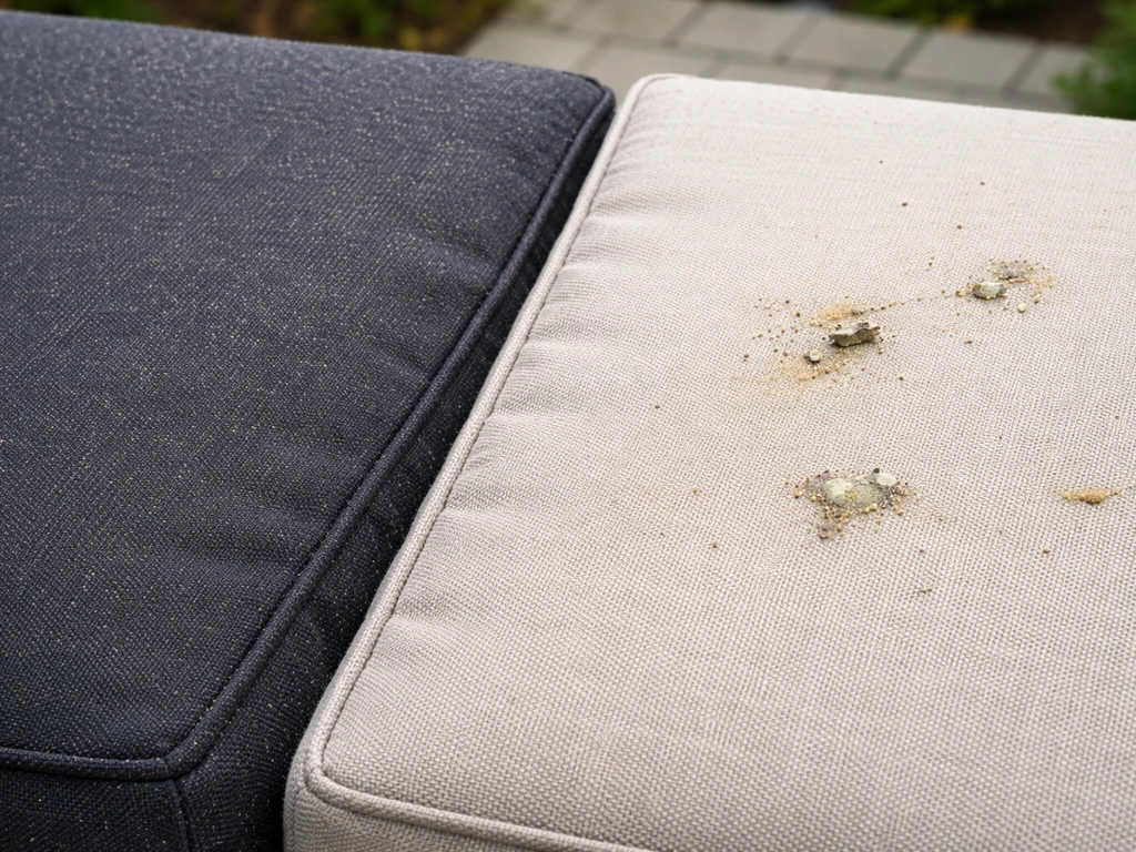
Fading is the other big one. Counterintuitively, darker colors like black, dark bronze, and charcoal gray tend to resist visible fading better than lighter shades. The reason comes down to pigment concentration and UV stabilizer chemistry: dark pigments contain more dye mass, so UV degradation has to work harder before the shift becomes visible to the eye. White and light gray frames, meanwhile, can yellow or take on a chalky, washed-out look after two or three seasons. This doesn't mean dark always wins, but it's worth knowing before you fall in love with a bright white set.
On the upkeep side, color is almost entirely about visibility. Dark frames show pollen, bird droppings, and salt deposits from coastal air very clearly. Light frames reveal mildew and mold staining. A mid-tone warm gray or taupe is genuinely the easiest to maintain because it hides both. If you're on the coast, light or woodgrain-style finishes conceal salt deposits better than dark finishes, which is a real practical advantage for anyone near salt air.
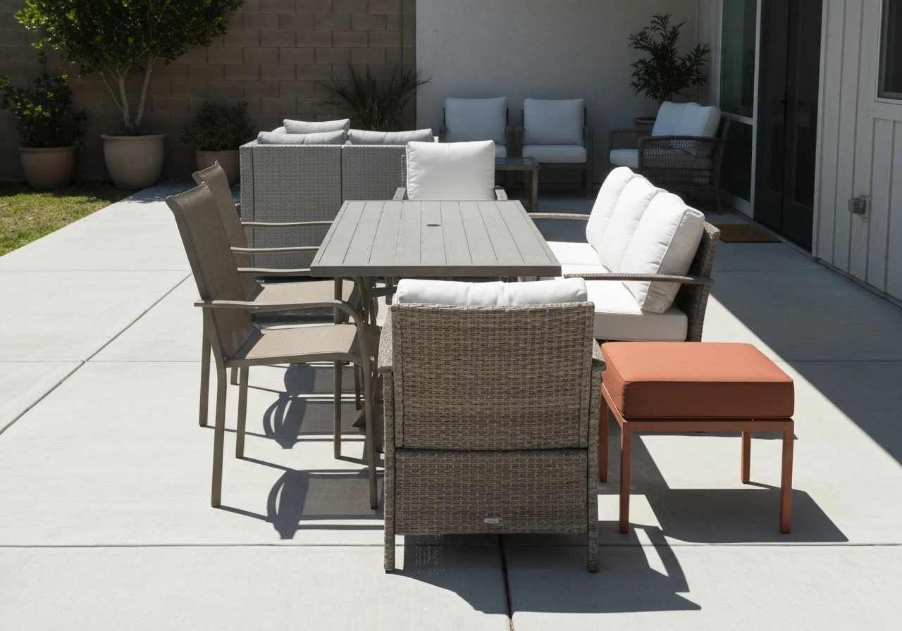
Match furniture color to your outdoor space
Before you pick a color in isolation, walk out and look at what you already have: the patio floor, any walls or fences, the house exterior, and your landscaping. Your furniture is going to live inside all of that, and if the colors fight each other, no individual piece is going to look right.
Concrete, pavers, and tile floors
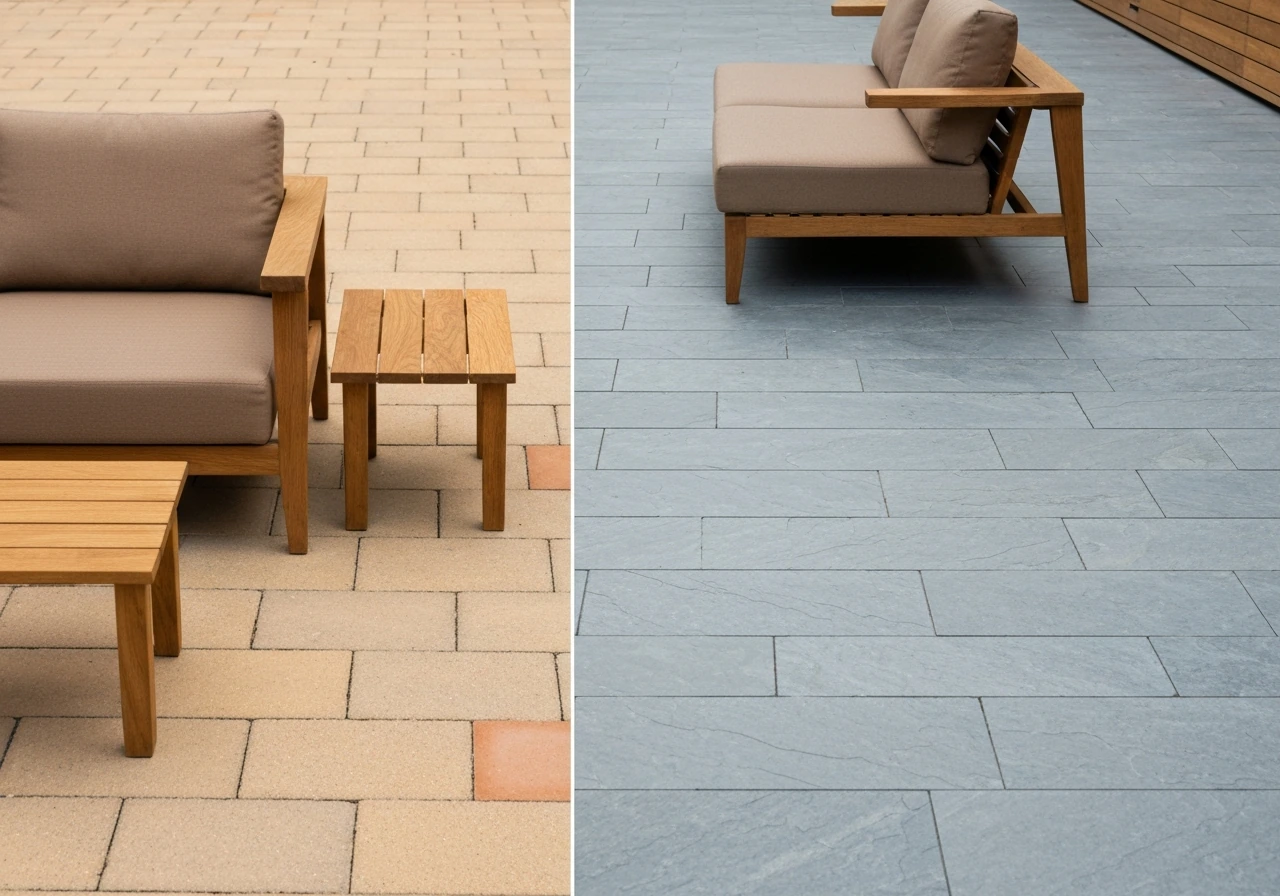
Warm-toned pavers (sandy beige, terra cotta, tan) pair naturally with warm neutrals like taupe, warm gray, or wood tones. Cool gray concrete or slate-look tile is the natural home for charcoal, cool gray, or black furniture. Avoid trying to perfectly match the floor color with the furniture frame. A slight contrast reads as intentional design. A near-match that's slightly off looks like a mistake.
Red brick walls and exteriors
Red brick is one of the trickier exterior elements to work around because it has strong warm undertones and a lot of visual weight. Beige and cream furniture warm up the space and feel harmonious against brick without competing. Gray creates complementary contrast and keeps things from feeling too earthy. Avoid red, orange, or rust furniture against red brick because it creates a muddled, overwhelming palette. Black works if you want a crisp, modern contrast, but it absorbs a lot of heat if the brick wall is south-facing. This topic comes up enough that it deserves its own detailed treatment, which you'll find in a dedicated guide on what color patio furniture goes with red brick. If you want, you can also use this guide alongside our tips on how to choose patio furniture colors for a cohesive, comfortable look.
Landscaping and greenery
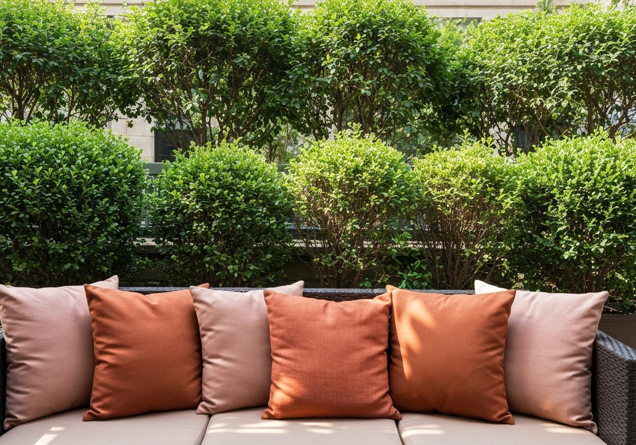
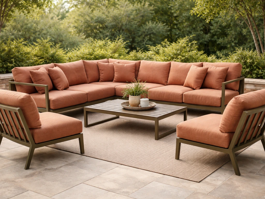
Green is already dominant in most outdoor spaces, so furniture colors that sit opposite it on the color wheel, like warm terra cotta, rust, or dusty rose cushions, create vivid contrast. If you prefer harmony over contrast, warm wood tones and olive or sage cushions blend into the landscape naturally. Deep forest green furniture can disappear into dense plantings in a way that feels intentional and lush rather than lost.
Best color choices by vibe
Your color direction should reflect the feel you're going for. Here's how the most common aesthetic goals translate to actual color choices:
| Vibe | Frame Color | Cushion Direction | Best For |
|---|---|---|---|
| Neutral / Classic | Warm gray, taupe, sand | White, cream, or soft stripe | Almost any home style; easy to update cushions later |
| Modern / Minimalist | Charcoal, matte black, cool gray | Dark gray, slate, or no cushion | Concrete floors, steel or glass accents, minimal landscaping |
| Natural / Wood Look | Teak, eucalyptus, or woodgrain composite | Linen, olive, sage, warm beige | Traditional homes, warm-toned brick, lush plantings |
| Bold Statement | Deep navy, forest green, terracotta | Contrasting or tonal | Smaller spaces that need personality; shaded patios preferred |
Neutral is the most forgiving choice and the easiest to refresh over time since you can swap cushion covers without replacing the whole set. Bold colors work best in shaded or semi-shaded spaces because they tend to fade faster in direct UV exposure, and their visual impact is strongest without harsh midday glare washing them out.
Light vs dark: choosing based on sun exposure and comfort
This is the single most practical filter for narrowing down your options. How much direct sun does your patio get, and when does it get it?
- Full sun all day (south-facing, no shade structure): Stick with light to mid-tone finishes. White, light gray, sand, or warm beige keep surfaces cooler and seating more comfortable. A landscape designer quoted in Livingetc put it bluntly: black furniture in a south-facing garden is a bad idea. Go with beige, pale gray, or pale neutrals instead.
- Morning sun, afternoon shade (east-facing): Most colors work here. You can go darker because the furniture cools down by mid-afternoon. This is where charcoal and dark bronze shine.
- Mostly shaded (covered pergola, north-facing, or dense tree canopy): Dark colors are a great fit. They look crisp and elegant in low light and don't have the heat-gain penalty. They can also show mildew more clearly, so budget for occasional cleaning.
- Coastal and salt-air patios: Lighter and woodgrain finishes win here. They conceal salt deposits far better than dark finishes, which makes maintenance much more manageable year-round.
Privacy is a secondary factor some people overlook. Dark furniture visually recedes and can create a sense of enclosure in an open space, which some people love in smaller urban patios. Light furniture expands and opens a space visually, which suits smaller patios that need to feel less cramped.
Mixing metals, woods, wicker, and cushion colors without clashing
Most real-world patios mix materials, and that's fine. The key is giving your mix a common thread so it reads as curated rather than random.
When mixing metal frames with wood or wicker elements, stay in the same temperature family. Warm metal tones (bronze, brushed brass, warm matte black with warm undertones) go with teak, warm-toned wicker, and warm beige or linen cushions. Cool metal tones (silver aluminum, cool charcoal, cool gray powder coat) go with gray-washed wicker, cool-toned composite wood, and cool white or slate cushions. Choosing the best colors for metal patio furniture also depends on whether you want a cool-toned look, more heat resistance, and easier maintenance in your specific sun exposure cool charcoal, cool gray powder coat.
You don't need to match finishes exactly. In fact, a bit of variation between the dining set and a side table or planter stand is normal and expected. What kills a mixed-material patio is fighting temperatures: a warm teak table paired with a cool chrome chair base and lime-green cushions is pulling in three different directions at once.
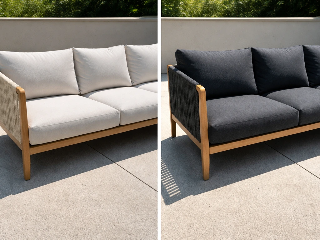
Cushion color is where most of the design flexibility lives, and it should be treated separately from frame color. Think of the frame as a neutral anchor and the cushions as the variable. A charcoal aluminum frame can go from all-business modern (slate cushions) to relaxed coastal (navy and white stripe) to warm Mediterranean (rust and cream) just by changing the upholstery. Solution-dyed acrylic outdoor fabrics can hold color for 1,500+ UV hours across multiple seasons, so investing in quality cushions lets you shift the whole palette when you're ready for a change without buying new furniture.
If you're working with bold colors in some elements, anchor them with classic neutrals. Navy chairs read well next to a natural teak table and white cushions. A bold green sofa needs gray, sand, or cream accessories to keep the palette grounded. Using a bold color as the only frame in an otherwise neutral setting is a strong design move. Using bold colors everywhere usually ends up looking busy.
Shop smarter: test the color in real outdoor light before you buy
Store lighting is terrible for evaluating outdoor furniture color. The fluorescent or LED ambient light in a showroom is nothing like noon sun, overcast morning light, or late afternoon golden hour on your patio. Architectural color guidance from ColorArchive recommends evaluating color under all the lighting conditions present in the actual space, and that principle applies directly here.
- Order samples or swatches before committing. Most quality outdoor fabric brands offer cushion fabric samples. Hold them against your existing flooring, walls, and house exterior at different times of day.
- If you're buying in-store, take a photo of the piece in the showroom, then look at it against a photo of your actual patio. It's a quick sanity check for tone and temperature.
- For frame color, look at the manufacturer's powder-coat swatch in direct sun and in shade if possible. Sheen matters too: matte finishes look very different from satin or gloss in sunlight, and gloss will show scratches and water spots more visibly.
- Check how the color reads at your peak sun time and at dusk. Gray can look blue-purple in evening light. Warm beige can look almost orange in late afternoon direct sun.
- If the retailer offers a return window, take advantage of it. Get a piece home, set it in place, and live with it for a weekend before committing to a full set.
Plan your cushion and frame colors separately from the start. Decide on the frame first as your anchor, then build the cushion palette around it. If you're torn between two frame colors, ask yourself which one gives you more cushion flexibility for the look you want. The frame is the harder thing to change; the cushions are not.
Maintenance reality: what color hides wear and what shows it
Every color direction has a maintenance trade-off. Here's the honest breakdown:
| Color | What It Hides | What It Shows | Cleaning Priority |
|---|---|---|---|
| Black / Dark charcoal | Scratches and general frame wear | Pollen, bird droppings, salt deposits, dust | High in open or coastal settings; moderate in covered areas |
| White / Cream | Pollen and dust (briefly) | Mold, mildew, yellowing, stains on cushions | High; yellowing on frames is hard to reverse |
| Warm gray / Taupe / Sand | Most dirt, pollen, mild staining | Heavy mold or rust streaking | Low to moderate; easiest overall maintenance profile |
| Natural wood tone (teak, composite) | Surface-level dirt, weathering patina | Mold in grain texture; deep staining on real wood | Moderate; real wood needs seasonal treatment |
| Bold colors (navy, green, rust) | Mid-tone dirt | Fading over time is most visible on bold hues | Moderate; UV protection is critical for longevity |
For powder-coated aluminum frames regardless of color, the cleaning routine is simple: a garden hose to rinse loose pollen and dust, then mild dish soap and lukewarm water for actual cleaning. For oxidized spots or stubborn mineral deposits, a 1:1 white vinegar and water solution handles most light corrosion without damaging the finish. The key difference between dark and light frames is just visibility: dark frames make you notice pollen and bird droppings faster, so you'll clean more often, not differently.
Cushion care is a separate story from frame care. Warm soapy water handles routine cleaning, and a vinegar-bicarbonate spot treatment works on mildew and stains. Avoid pressure washing cushions because it damages seams and fabric fibers and can actually push moisture deeper into the fill, which worsens mold risk. Light-colored cushions (white, cream, pale linen) require the most frequent cleaning and are most likely to show permanent staining. If you love the look of white cushions, get them in a zip-off, machine-washable cover.
On fading: the color that holds longest on frames is typically dark charcoal or matte black in a quality powder-coat finish, because UV damage has to degrade significantly more pigment before the shift becomes visible. Light frames don't fade as dramatically in terms of color shift, but they chalk and dull more noticeably. On cushions, solution-dyed acrylic is the gold standard regardless of color because the pigment runs through the fiber rather than sitting on top. If someone is selling you a budget cushion in a bold color with no mention of solution-dyed construction, expect noticeable fading by the end of the first full season.
If you're specifically interested in how color options break down for metal frames, or want a deeper comparison of the best overall outdoor colors across different contexts and materials, those are worth exploring in more detail. The decisions around metal specifically involve powder-coat quality and finish type in addition to color, and the broader color-selection question has a few more nuances depending on your exact design goals.
FAQ
I love the look of black patio furniture, but will it be too hot in full sun? What should I choose instead?
If you get a lot of direct sun, prioritize a frame shade that feels comfortable to sit on. A medium-toned warm gray/taupe, or even a light woodgrain-look aluminum/steel, is usually safer than black because it heats less. If you love black for the look, look for high-quality powder coating and consider adding light-colored cushions or using shaded seating during peak heat hours.
Should I try to match my patio floor color exactly when choosing what color patio furniture should I get?
For most people, the simplest practical rule is: match undertones, not exact colors. Use warm furniture colors (taupe, warm gray, bronze, teak, linen) with warm-toned floors like sandy beige or terra cotta, and use cool tones (charcoal, cool gray, slate-look) with cool-gray concrete or tile. A deliberate contrast that is close to the undertone family almost always reads better than a perfect but slightly mismatched “photo match.”
If I have a shaded patio, can I choose bolder furniture colors without worrying as much about fading?
Yes, especially with cushion color. Frames can be relatively forgiving, but bold or very light cushions tend to show fading, mildew, and dirt sooner in strong UV areas. If you want high-impact color, keep the frame neutral and choose the boldest shades for cushions only, then plan to refresh cushion covers (or replace cushions) every few seasons as needed.
How does the “choose a color” advice change if my patio furniture is wood or synthetic wood instead of metal?
Wood furniture colors do not behave the same as powder-coated metal. Natural wood tones are often easier to keep looking cohesive, but they can show weathering differences faster depending on species, oil/finish type, and whether the furniture is exposed to rain. If your patio is humid or coastal, consider woodgrain-look synthetic materials or sealed wood and choose lighter or mid-tone finishes to reduce visible salt and water spotting.
What color patio furniture should I get if I’m going for a cozy, traditional look rather than modern?
Start with whether you want contrast or blending. Dark charcoal or black creates a crisp, modern boundary, but it can look harsh in very bright, airy spaces if you also use light floors and white walls. Warm neutrals (taupe, warm gray) tend to look more natural across seasons and let you switch cushion colors later without the whole set feeling off.
How does furniture color affect how private or open my patio feels?
If privacy is the goal, dark furniture can make an open patio feel more enclosed because it visually “sinks” and recedes. If your patio is small and you want it to feel larger, lighter furniture colors reflect more light and visually expand the space. The best compromise is often a medium neutral frame with lighter cushions, so you get definition without closing the area in.
What’s the easiest decision strategy if I can’t decide between two frame colors?
The frame is the anchor and cushions are the variable. If you’re torn between two frame colors, pick the one that gives you the most cushion options in both directions (cool and warm). For example, warm gray/taupe cushions can work with navy, cream, rust, and olive, while cool charcoal frames pair more easily with slate, white, and blue-gray tones.
If I choose light or white cushions, what cleaning and maintenance should I realistically expect?
Cushion covers need to be designed for your cleaning reality. If you regularly face pollen, coastal salt, or heavy morning dew, light cushions can stain more visibly, and dark frames can make you notice dirt sooner. If you want “white” cushions, choose zip-off, machine-washable covers and plan more frequent rinsing before stains set.
Can I mix metal and wood patio furniture colors, or will it look mismatched?
Yes. For mixed materials, keep the color temperature consistent, warm-with-warm or cool-with-cool, and avoid pairing bright warm accessories with cool-toned metals. Also, ensure you are not mixing three different color “personalities” at once (for example, cool chrome, warm teak, and high-chroma lime). A small amount of finish variation is fine if the undertones align.
Why do patio furniture colors look different at home than in the store, and how can I avoid that mistake?
If you’re choosing based on showroom appearance, you might be underestimating real sunlight effects. Colors should be checked in your actual patio lighting (morning, midday, and late afternoon). If possible, hold fabric swatches or sample pieces outdoors next to the furniture you already own for a day, then decide after you see how the shade behaves in direct sun versus shade.
Next Articles
Best Color for Outdoor Patio Furniture: Top Picks
Best color for outdoor patio furniture with top picks by material, fade and heat tips, and maintenance to keep it lookin
Common Patio Furniture Wood: Best Choices, Care & Tips
Compare common patio furniture wood types, teak, cedar, redwood, oak, with durability, finishes, and care tips.
Best Wood Patio Stain: Choosing Durable, Low-VOC Finishes
Compare and choose the best wood patio stain: durability, finish, climate tips, prep, and top product picks.