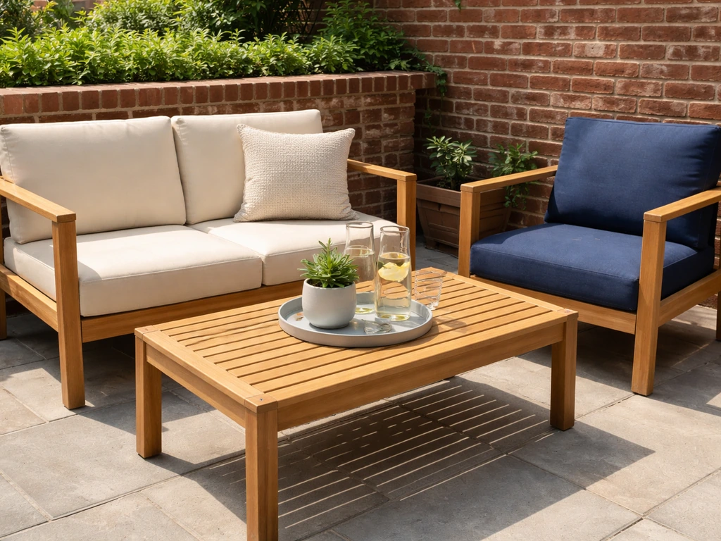
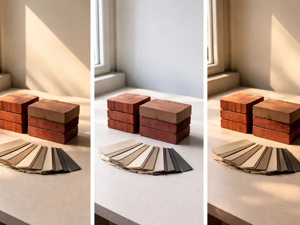
Warm neutrals and earthy tones are your safest, most reliable bet with red brick. Think charcoal gray, warm black, taupe, cream, teak brown, and terracotta-adjacent tones. These work because red brick is a warm-toned material, and the goal is to stay in the same color temperature family rather than fight it. Navy and forest green also work beautifully as bold anchors, as long as you lean toward slightly warmer versions of those shades rather than the icy, blue-cool varieties.
What Color Patio Furniture Goes With Red Brick?

Theo Tierney
10 Jun 2026
Start with color temperature, not just color
Before you pick a single furniture color, hold up any sample next to your brick in natural light and ask one simple question: does this read warm or cool? Red brick almost always has warm undertones, ranging from orange-red to a deeper burgundy-rust. If you choose a "neutral" that secretly leans cool (think gray with a blue or purple cast, or a stark crisp white with a blue base), it will look off next to warm brick even if you can't immediately put your finger on why. That disconnect is color temperature mismatch, and it's the root cause of most patio furniture choices that just don't feel right.
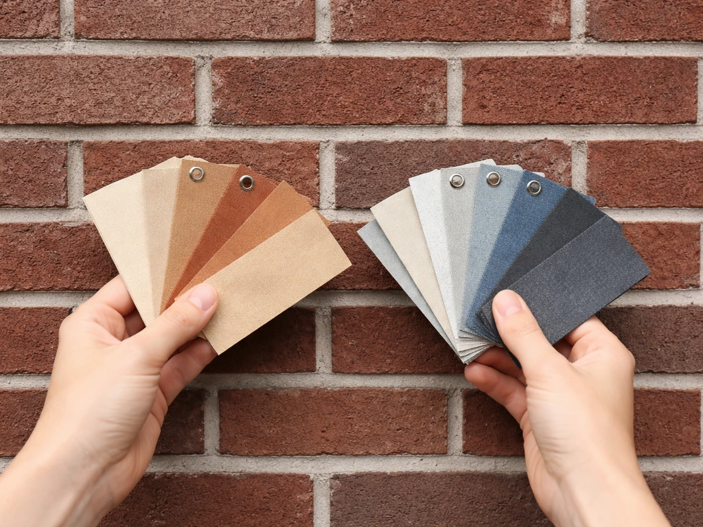
The fix is simple: match warm with warm. Warm gray (greige), taupe, ivory, cream, walnut brown, warm white, and charcoal with brown-black undertones all stay on the warm side. If you want the best color for outdoor patio furniture that will complement red brick, start with these warm-toned neutrals warm gray (greige), taupe, ivory, cream, walnut brown, warm white, and charcoal with brown-black undertones. Cool gray, bright white, slate, and pastel blues drift cool. This single rule will eliminate about half the mistakes people make before they even get to choosing a specific product.
The best furniture colors for red brick patios
Neutrals that always work
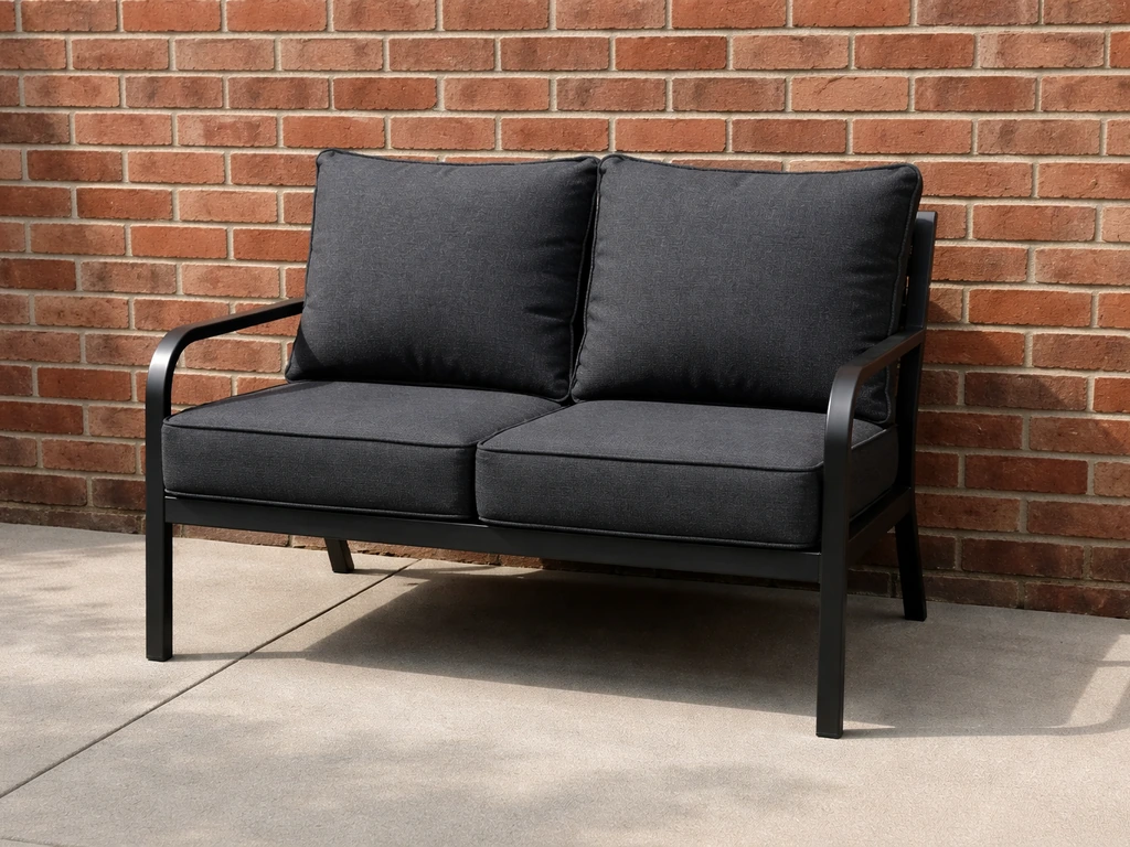
Warm charcoal and warm black are probably the most versatile finishes you can buy for a red brick house. For metal patio furniture specifically, keep your picks anchored in warm neutrals and earthy shades so the finishes stay cohesive with red brick best colors for metal patio furniture. They anchor the space visually, they're widely available in every material category (powder-coated aluminum, cast iron, teak with dark stain, all-weather wicker), and they let the brick do its thing without competing. Warm black has slight brown or bronze undertones that keep it from reading harsh. If you're buying metal furniture and see a finish labeled "matte black" or "oil-rubbed bronze," those are typically good candidates.
Taupe and warm greige (beige-gray hybrid) are equally dependable in lighter furniture. These tones echo the mortar lines in brick, which creates a subtle visual cohesion that just looks intentional. Cream and ivory work well too, especially in wicker or resin weave furniture where the texture softens the brightness.
Bold colors that complement rather than clash
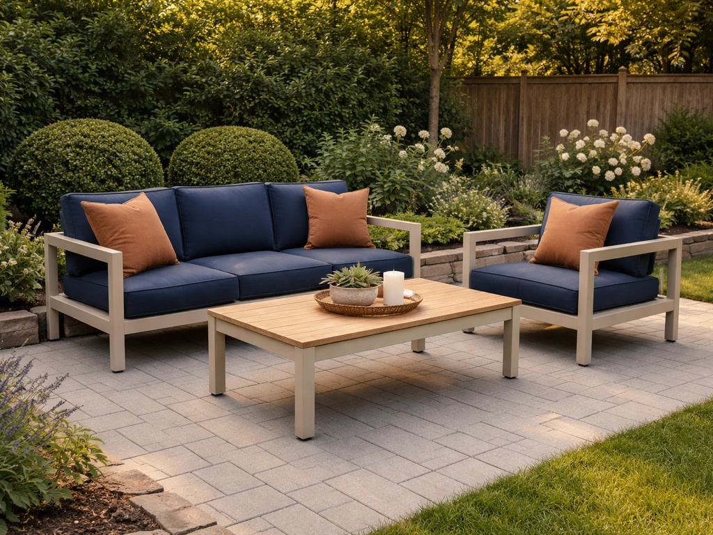
Navy blue is the most popular bold pairing with red brick, and it earns that reputation. It provides strong contrast without the visual noise of a competing warm tone. The key is choosing a navy that tilts slightly warm (toward indigo) rather than a cold, electric navy. Forest green and olive also pair well because they reference the landscape itself, reinforcing the earthy palette that brick naturally lives in.
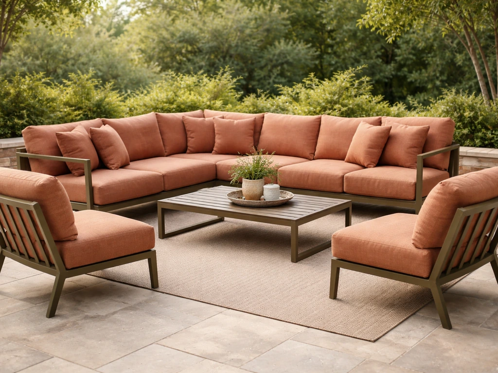
Terracotta and rust-toned furniture are worth considering if you want a tone-on-tone look. These sit in the same warm-earthy family as the brick and create a layered, cohesive feel rather than a jarring contrast. They work especially well in wicker and cushion fabrics, though they require attention to fade resistance over time (more on that shortly).
Quick comparison across common color families
| Color / Finish | Works With Red Brick? | Best Use | Key Watch-Out |
|---|---|---|---|
| Warm charcoal / warm black | Yes, excellent | Metal frames, teak stain | Dark finishes absorb heat; prioritize shade in full-sun spots |
| Taupe / warm greige | Yes, excellent | Wicker, resin, powder-coat | Verify it has yellow/red undertone, not blue-gray |
| Cream / ivory | Yes, very good | Wicker, fabric, resin | Shows dirt faster; needs regular cleaning |
| Navy (warm/indigo-leaning) | Yes, very good | Cushions, metal accents | Cool-toned navy can read blue-cold next to warm brick |
| Forest green / olive | Yes, very good | Frames, cushions, planters | Muted/earthy versions only; bright lime-green is too loud |
| Terracotta / rust | Yes, good | Cushions, wicker, accents | Fades faster in UV; invest in solution-dyed fabric |
| Warm white (cream-base) | Yes, good | Cushion fabric, resin | Shows dirt; not ideal for dusty or high-traffic spaces |
| Cool/blue-gray | Risky | Avoid near warm orange-red brick | Clashes in temperature; looks disconnected |
| Bright red or burgundy | Avoid | Any frame or dominant fabric | Competes directly with brick; visually overwhelming |
| Cool bright white (blue-base) | Avoid | Any dominant surface | Stark contrast amplifies brick's warmth in a harsh way |
| Pastel lavender / cool pink | Avoid | Any use near warm brick | Cool undertones fight warm brick consistently |
Colors and combinations to steer clear of
Matching red to red is the most common trap. If your brick reads red-orange, adding a bright red or burgundy furniture piece doesn't create harmony, it creates competition. The eye doesn't know where to settle, and the whole space feels busy and overwrought. Same goes for warm saturated oranges and deep coral, which echo the brick too closely and amplify it in a way that rarely looks intentional.
Cool-toned neutrals are the sneaky problem. A gray that looks perfectly fine in a paint chip can look oddly cold and disconnected once it's sitting next to your warm brick in afternoon sun. The same goes for stark, blue-based white. If you're buying furniture described as "slate gray," "fog," or "cool white," hold a sample up to the brick before committing. What looks neutral in a showroom or on a website can read visually cool and mismatched on-site.
Finish mismatches matter too, not just color. A high-gloss finish on a metal frame next to matte brick creates a textural discord that's separate from color temperature. Matte and satin powder-coat finishes generally sit better next to brick than highly polished or chrome finishes, which can feel industrial and out of place in a traditional brick context.
Pulling the whole patio together: cushions, rugs, planters, and trim
Your furniture frame color is the anchor, but the accessories are where the palette either comes together or falls apart. Here's a practical framework: pick a dominant neutral for the frame, use cushion fabric to introduce one warm accent color, and let planters and rugs echo one or both of those tones. Don't try to introduce three separate accent colors across cushions, rugs, and planters. It gets chaotic fast outdoors.
For cushions on neutral-framed furniture next to red brick, warm earthy tones work best: terracotta, mustard yellow, olive, cream, navy, or warm rust. If your front door is painted a color (a popular design move with brick homes), pull that color into a cushion or throw pillow rather than adding something new. That single thread of repetition is what makes a patio feel designed rather than assembled.
Planters in terracotta clay, weathered bronze, or matte black reinforce the earthy palette effortlessly. Avoid plastic planters in bright white or cool gray, which tend to cheapen the overall look. For outdoor rugs, a natural jute or sisal tone ties in with earthy wood and wicker frames, while a navy-and-cream stripe pattern with warm-toned outdoor fabric adds a more polished look without clashing with the brick.
Don't overlook your outdoor lighting fixtures. Warm white bulbs in the 2700K to 3000K range are the right call for patios adjacent to red brick. They cast a flattering, amber-adjacent glow that reinforces the warmth of the brick rather than bleaching it out. If your fixtures currently have cool-white or daylight-range bulbs (4000K or higher), swapping those out is a five-minute fix that can change how the entire space reads in the evening.
How material and finish affect color over time
Color choices don't exist in isolation from material choices. A warm charcoal on a quality powder-coated aluminum frame will hold that color for years with minimal maintenance. The same charcoal tone on a cheaply painted steel frame will start to fade, chalk, or rust within two to three seasons. The color you chose is right; the material just can't sustain it. This is why material selection and color selection are inseparable decisions.
Metal furniture
Powder-coated aluminum is the best metal frame option for color retention outdoors. The powder coat bonds deeply to the surface and resists UV fade, chipping, and rust far better than liquid paint. Dark colors like warm black and charcoal do absorb more heat than lighter finishes, so if your patio gets full afternoon sun in a hot climate, be aware that dark metal frames can get uncomfortable to touch. That's not a reason to avoid them, just a reason to think about placement and whether you want seat cushions as a buffer. Avoid wrought iron in any high-humidity coastal climate regardless of color, because the maintenance burden becomes a color maintenance burden too when rust bleeds through the finish.
Wood furniture
Teak and acacia in their natural or lightly oiled state produce a warm honey-to-golden-brown tone that works beautifully with red brick. Left unfinished, teak weathers to a silver-gray over time, which actually lands in a warm-gray zone that still pairs reasonably well with warm brick. If you prefer to maintain the golden tone, a teak oil applied once or twice a year keeps the color consistent. Darker stained wood (walnut or ebony stains) reads as a warm dark tone similar to warm black metal and pairs just as well with brick. The watch-out with any wood finish is UV breakdown: clear-coat finishes fade before the wood itself does, so factor in refinishing every few years.
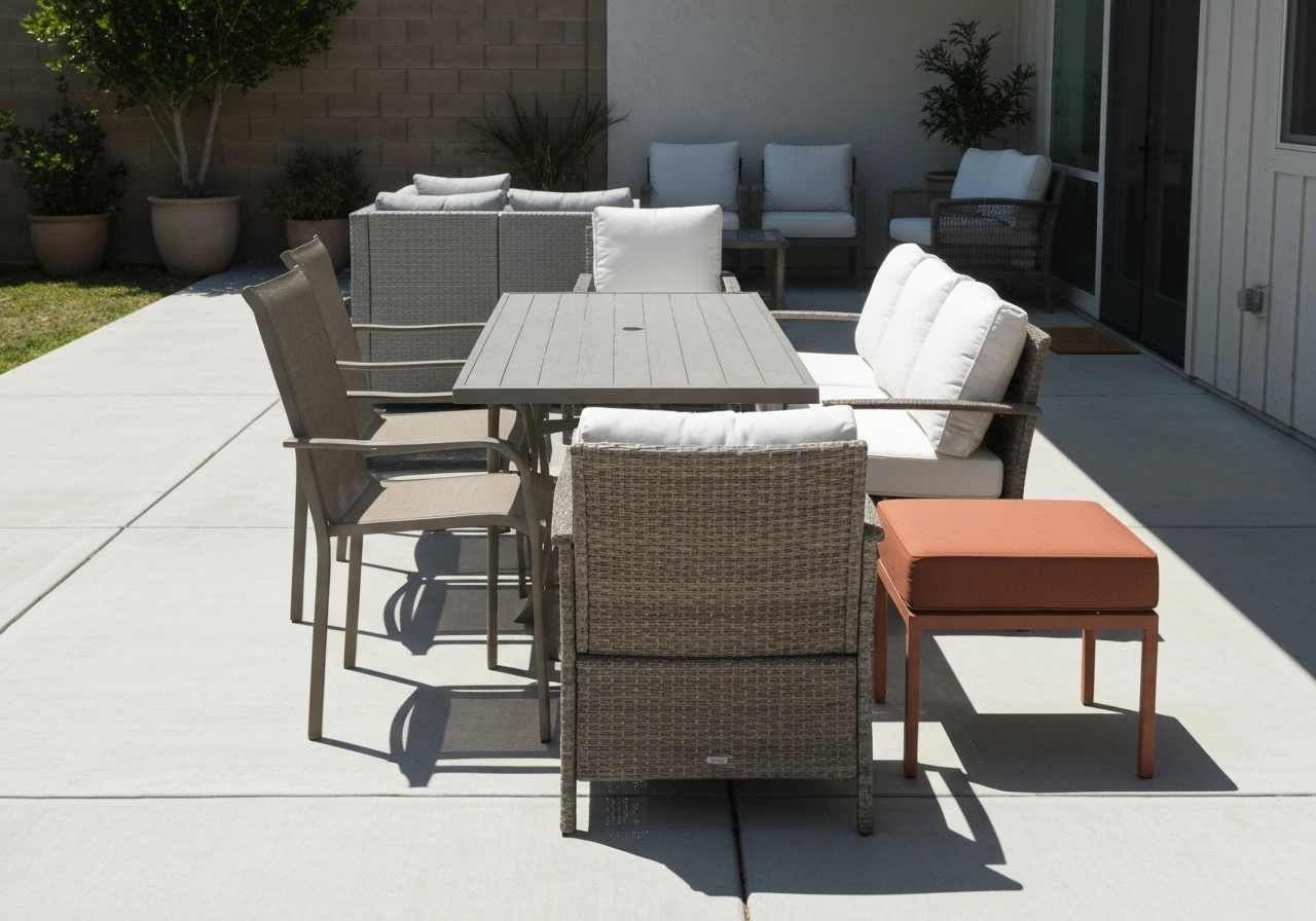
All-weather wicker and resin
Wicker furniture typically comes in a narrow range of tones: honey/natural, mocha brown, gray-brown (driftwood), and black. The honey and mocha tones are warm and pair naturally with red brick. Driftwood gray sits in a middle ground and can work if it leans warm rather than cool. Black wicker is a strong, clean option. What matters more with resin wicker is the quality of the weave material: HDPE (high-density polyethylene) wicker holds its color and structural integrity far better than cheaper PVC resin in UV exposure. A well-made mocha HDPE wicker set will still look right in year five; a cheap alternative may have faded to a blotchy tan by then, regardless of how good the initial color match was.
Composite and resin furniture
Composite and recycled-plastic lumber furniture (often marketed as HDPE lumber or poly lumber) comes in a wide range of colors including warm teak-tones, charcoal, dark green, and various browns. These materials hold color exceptionally well because the pigment runs through the entire material rather than sitting on the surface. They're a good choice for anyone prioritizing long-term color fidelity without maintenance. The color options are somewhat limited compared to powder-coated metal, but the warm teak, chestnut, and charcoal colorways available are all well-suited to red brick.
Cushion fabric
Dark fabrics, including navy, terracotta, and warm rust, fade faster than light colors and pastels when exposed to UV. If you choose those tones for cushions (and they do look great with red brick), invest in solution-dyed acrylic fabric like Sunbrella or a comparable brand. Solution-dyed fabric has color embedded in the fiber rather than applied on top, which gives it dramatically better fade resistance. A terracotta cushion in solution-dyed acrylic will still look close to its original color after three or four seasons. The same color in a cheaper polyester fabric will start looking washed-out and sad within one.
Test before you buy: practical steps you can do today
One of the most consistent mistakes people make is choosing furniture color from a website photo or a tiny swatch in a showroom. Colors look different in different lighting conditions, a phenomenon called blank" rel="noopener noreferrer">metamerism. Two finishes can look identical indoors under fluorescent light and noticeably different outside in afternoon sun. The only way around this is to test samples in your actual space, at your actual lighting conditions. If you want a more complete checklist for how to choose patio furniture colors for your specific space, use the same warm-versus-cool undertone approach.
- Photograph your brick in the morning, midday, and late afternoon. Brick color shifts more than people expect across a day, from cool-ish in morning light to warm orange-red in afternoon sun. The time of day when you actually use the patio most is the lighting that matters most for your color decision.
- Order or borrow physical samples. Many furniture retailers offer swatches or small finish samples for free or low cost. For metal frames, ask for powder-coat color chips. For fabric, most quality suppliers will mail 4-to-6-inch swatches.
- Hold the sample against the brick at different times of day, not just once. Place it at the scale it will actually appear: a small chip looks different than a full chair frame. If you can, prop up a larger piece of cardboard painted or covered in the candidate color.
- Check your samples under your outdoor lighting at night. If you have string lights, lanterns, or wall fixtures, turn them on and look at the sample under that light. This is the metamerism check: a warm charcoal that looks right in daylight should still look right under your 2700K warm-white outdoor fixtures. If it looks oddly cool or muddy under your lights, the color temperature isn't matching.
- Compare warm versus cool versions of the same nominal color side by side. Order two gray swatches: one greige (warm gray) and one slate (cool gray). Hold them both next to your brick at the same time. The difference becomes immediately obvious and saves you from making an expensive mistake.
- Take all your sample photos in shade and in direct sun. Direct sun can wash out lighter colors and intensify darker ones in ways that change the apparent match to the brick.
If you're still on the fence between two colors after testing, go with the warmer option. Red brick is forgiving with warm tones and unforgiving with cool ones. A slightly warmer charcoal than you intended still looks cohesive. A slightly cooler gray than you intended looks like a mistake.
One last practical note: if you're thinking through the broader question of which colors work best for outdoor furniture across different settings and materials, the principles here connect to the same undertone and material-performance logic that applies generally to any outdoor color decision. Red brick just makes the warm-tone rule especially clear and non-negotiable.
FAQ
Can I use gray patio furniture with red brick without it looking off?
Yes, but only if the gray is warm-leaning (greige or brown-gray) and not blue- or purple-cast. To verify quickly, place a fabric or paint-swatch sample next to the brick in late-afternoon light, then check whether the “gray” looks slightly beige or brown rather than steel. If it looks crisp or icy, switch to warm charcoal or warm black.
What cushion colors work best with red brick if the furniture frame is neutral?
Aim for textiles that repeat the brick’s warm undertones, not its exact saturation. For example, terracotta, warm rust, olive, cream, or warm navy cushions typically complement well, while bright cherry-red or cool burgundy can fight the brick’s orange-red presence. If you want a stronger contrast, use navy or forest green in the frame and keep cushion accents warm and earthy.
How should the answer change if my red brick is more orange-red versus burgundy-rust?
If your red brick reads more orange-red, lean toward cream/ivory, warm gray, and walnut browns for cohesion. If your brick reads more burgundy-rust, terracotta, warm black, and deeper warm charcoals usually look more intentional. The fastest method is to compare two samples (one warm neutral, one warm accent) side by side against the brick at the same time of day.
I’m buying metal patio furniture, what finish types should I avoid with red brick?
Consider keeping the metal finish warm and avoiding finishes that reflect light too sharply. Powder-coated matte or satin warm black, oil-rubbed bronze, or warm charcoal tend to sit naturally beside brick. Highly polished silver, chrome, or very blue-leaning “graphite” finishes can feel disconnected even if the color sounds similar online.
Can I mix multiple accent colors if I’m also matching red brick?
Yes, but treat it like an accent, not the primary base. Use neutral frames (warm charcoal, taupe, cream, or warm black) and introduce one warm accent through cushions or a rug detail, then mirror that color in planters or throws. Adding multiple unrelated accent colors across cushions, rug, and accessories usually breaks the warm, cohesive look.
What are the most common red-brick color traps beyond choosing a “red” furniture piece?
If your brick is already fairly saturated, avoid furniture colors that are too close in hue to the brick (bright red, vivid orange, coral). Instead, go one step away with warm neutrals (cream, ivory, greige, taupe) or a complementary bold like slightly warm navy or olive. This preserves contrast without making the patio feel busy.
How do I keep the patio colors looking right at night near red brick?
Update lighting rather than changing furniture color. Swap cool-white or daylight bulbs for warm white around 2700K to 3000K so brick and warm neutrals look natural at night. If you cannot change bulbs, lean slightly warmer in furniture selection (cream, warm black, warm charcoal) because cool lighting will otherwise exaggerate any cool-gray tendencies.
Are dark cushion colors still a good idea near red brick if the patio gets lots of sun?
If the furniture is solution-dyed acrylic, deeper colors like terracotta, navy, or warm rust can still look good after years of sun. For other fabric types (especially cheaper polyester), stick closer to light or mid-tone neutrals like cream, ivory, or warm taupe so fading is less obvious and overall tone stays cohesive.
How can I tell whether navy or forest green will be too cool for my specific brick?
Yes, but test because even within “navy” and “forest green,” undertones vary. Choose shades described as indigo-leaning navy or olive-adjacent green, then check in your actual space for warmth in the evening light. If the color looks slightly blue-cool compared to the brick, it will visually separate.
What planter and accessory colors best support the patio furniture color choice?
For planters, prioritize materials and finishes that echo warm earth tones, like terracotta clay, matte black, or weathered bronze. Avoid glossy bright white or cool-gray plastic because that shine and cool tone often make the whole seating palette look less upscale by comparison.
Does texture and aging (finish quality) change which patio furniture color I should pick?
Most finishes need matching texture, not just color. Matte or satin powder coat pairs more naturally with brick than glossy paint or chrome, and wood should be treated according to its tone and maintenance plan. If your furniture is likely to age quickly (cheap steel paint), choose a warmer, darker neutral that hides early fading and won’t look washed out.
Next Articles
How to Choose Patio Furniture Colors for Any Yard
Step-by-step how to choose patio furniture colors that match your yard, materials, and climate for lasting, balanced sty
What Color Patio Furniture Should I Get Today? A Guide
Choose the best patio furniture color for your sun, UV fading, dirt visibility, and your existing outdoor palette.
Best Color for Outdoor Patio Furniture: Top Picks
Best color for outdoor patio furniture with top picks by material, fade and heat tips, and maintenance to keep it lookin