Choosing patio furniture colors comes down to four things working together: what your patio surfaces already look like, how much sun the space gets, what material your furniture is made from, and how much maintenance you're actually willing to do. Get those four factors lined up and the color decision becomes a lot less stressful. Skip them and you end up with a gorgeous charcoal sectional that scorches your legs in July, or a set of warm teak chairs that clash badly with your cool gray concrete pavers. If you're still deciding, you can use the same guidelines to choose the right patio furniture color for your space and comfort level.
How to Choose Patio Furniture Colors for Any Yard

Theo Tierney
7 Jun 2026
Start by reading your patio environment
Before you even open a catalog, walk out to your patio at different times of day and look at what's already there. The surfaces surrounding your furniture do most of the visual heavy lifting, and you need to work with them, not against them.
Sun exposure is the first filter. A south-facing patio that gets direct sun from 9am to 5pm is a very different environment than a shaded north-facing corner. In full sun, dark colors absorb heat dramatically, making metal and solid-material furniture nearly untouchable on hot days. Light or medium tones reflect heat and stay cooler. If you want the best color for outdoor patio furniture in hot, sunny conditions, light or medium tones are usually the safest bet for comfort. In a shaded space, you have more freedom because fading and heat retention are less aggressive.
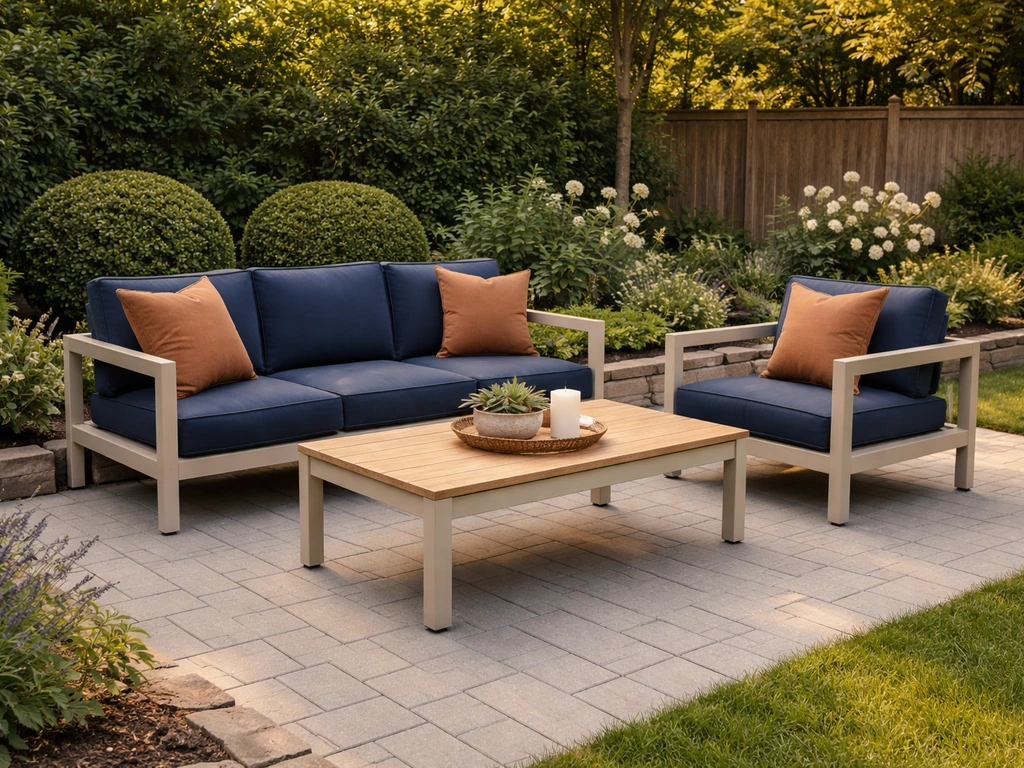
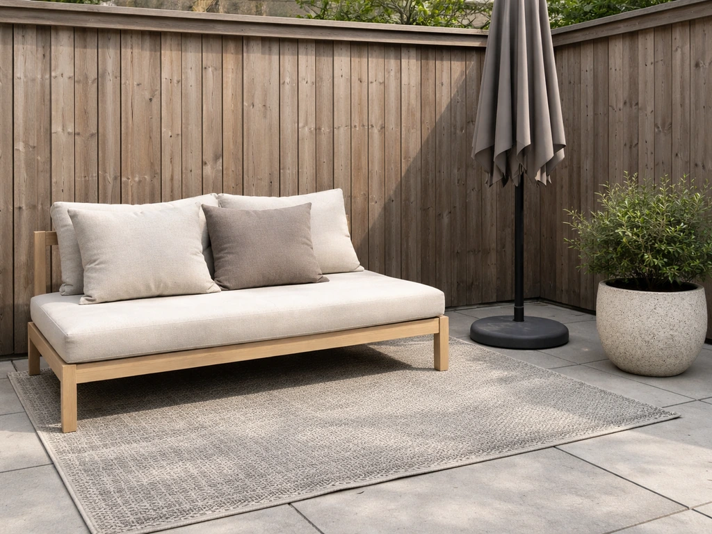
Next, look at your fixed surfaces: the floor material (concrete, pavers, tile, wood decking, brick), the exterior walls or siding visible from the patio, and any fencing or structural elements. These are your anchors. Warm surfaces like red brick, tan pavers, or cedar decking pull toward warm-toned furniture in browns, creams, terracotta, and deep greens. Cool surfaces like gray concrete, bluestone, or white painted walls pair cleanly with cool tones: charcoal, navy, sage, white, and black. Mixing a warm-toned floor with cool-toned furniture creates visual tension that most people find unsettling over time, even if they can't immediately articulate why.
Then consider your landscaping. Dense greenery gives you a living backdrop that works well with natural tones, whites, and earthy neutrals. A patio surrounded by colorful flower beds can handle bolder furniture colors. A mostly hardscape patio with minimal plantings needs the furniture to carry more of the visual warmth or interest on its own.
Finally, think honestly about your style goal: relaxed and natural, clean and modern, tropical and colorful, or classic and formal. Your style goal determines whether you lean toward a tonal, low-contrast look or a bold, high-contrast one. Write these things down before moving to color selection.
Pick a color strategy that actually works
There are three basic approaches to outdoor color, and each has a different risk profile. Understanding which one fits your situation saves you from second-guessing later.
Neutral foundations (the safest and most versatile)
Building your furniture frames and large-surface pieces in neutrals, including charcoal, greige, warm white, natural wood tones, or slate gray, gives you maximum flexibility to swap accent colors through cushions and accessories over the years. Neutral furniture frames rarely look dated, survive design trend cycles, and photograph well in every light. If you're unsure, this is always the right default. The risk is that an all-neutral patio can feel flat without intentional texture and layering.
Bold accent strategy
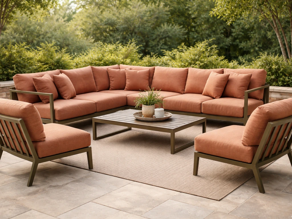
Here you keep frames neutral but introduce one or two strong accent colors through cushions, rugs, umbrellas, and planters. A charcoal aluminum frame with cobalt blue cushions and a terracotta planter is a common version of this approach. It works because the high-cost, hard-to-replace pieces stay neutral while the lower-cost, replaceable softgoods carry the color. This is the strategy I'd recommend to most homeowners because it's the easiest to update without a major investment.
Matching or tonal color sets
Buying furniture in a coordinated color set, such as all-white resin, a matching navy wicker collection, or a uniform teak finish, creates a polished, intentional look. The risk is inflexibility: if one piece needs replacing and the line is discontinued, matching it becomes difficult. Tonal sets also require clean surroundings to look their best, since visual clutter competes more aggressively against a unified color story.
Match your color choice to the material and finish
Color and material are not separate decisions. The material determines how color ages, how heat is retained, and what your maintenance reality looks like. Here's how the main material categories interact with color.
Aluminum and metal
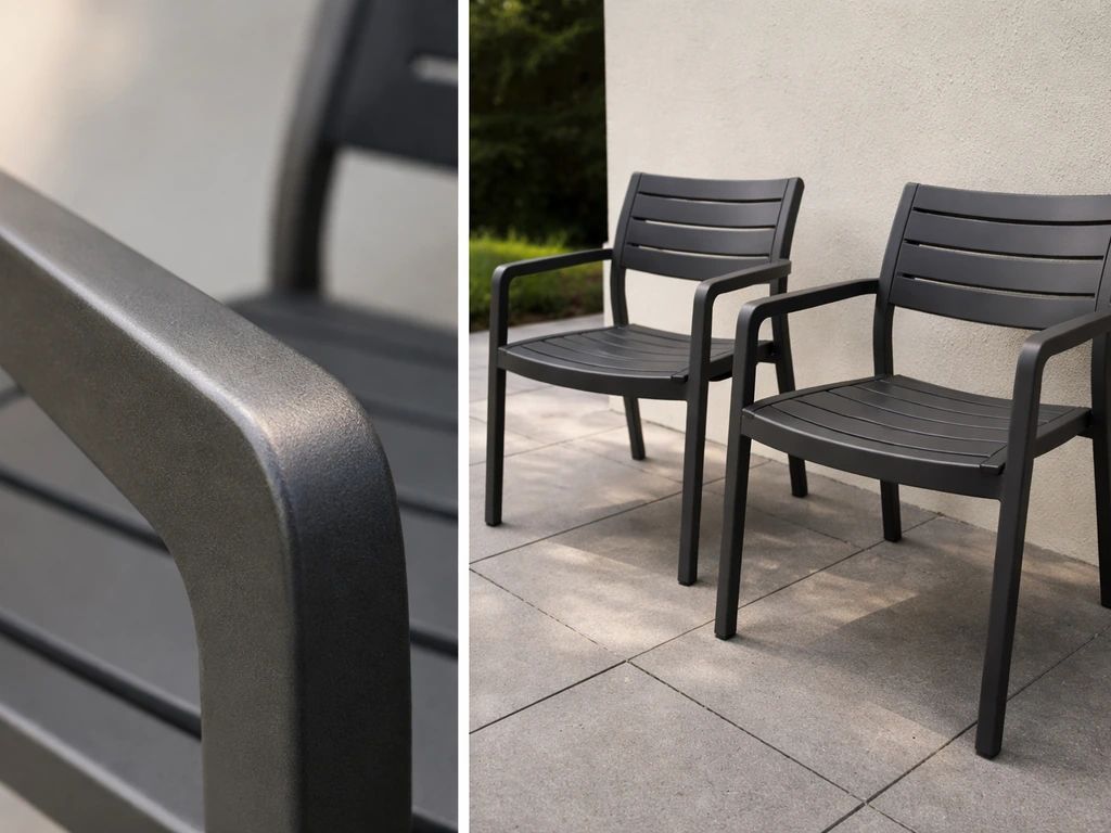
Powder-coated aluminum is where color choice matters most technically. For help choosing the right shade, see our guide to the best colors for metal patio furniture. The quality of the coating determines how long your color holds up. Look for AAMA 2604 or AAMA 2605 rated coatings. blank" rel="noopener noreferrer">AAMA 2604 is a 5-year performance standard that limits color fade to a Delta E (color change) value of no more than 5.0, measured against a baseline after UV exposure. AAMA 2605 is the more demanding spec, holding the same Delta E max of 5 over a 10-year period and requiring the coating to pass 4,000 hours of salt spray testing versus 3,000 hours for 2604. In plain terms, a 2605-rated finish will hold its color noticeably longer than a standard powder coat, especially in coastal or high-UV environments like Florida or Arizona. For dark colors like matte black, graphite, or deep bronze on metal, choose 2605 coatings specifically, because dark pigments show fading more visibly and absorb more heat. Medium tones like slate gray or warm bronze are more forgiving on lower-grade coatings. White and light gray on metal can show rust bleed at fasteners if the base metal or coating quality is poor, so check that fasteners are stainless steel or coated.
Wood
Natural wood furniture (teak, eucalyptus, acacia, shorea) starts as a warm golden or reddish-brown and will silver to a driftwood gray if left untreated. This natural silvering is actually UV bleaching of the lignin in the wood. If you want to preserve the warm wood tone, you need to apply a penetrating teak oil or UV-blocking sealer every one to two seasons, which is a real maintenance commitment. If you prefer the weathered gray look, you can let it silver naturally and it will reach a stable color, but the wood still needs cleaning and occasional treatment to prevent cracking. From a color coordination standpoint, natural teak and eucalyptus tones are warm and earthy, pairing well with sage green, warm white, terracotta, and cream cushions. Once silvered, they read more cool-neutral and work well with blues, grays, and whites.
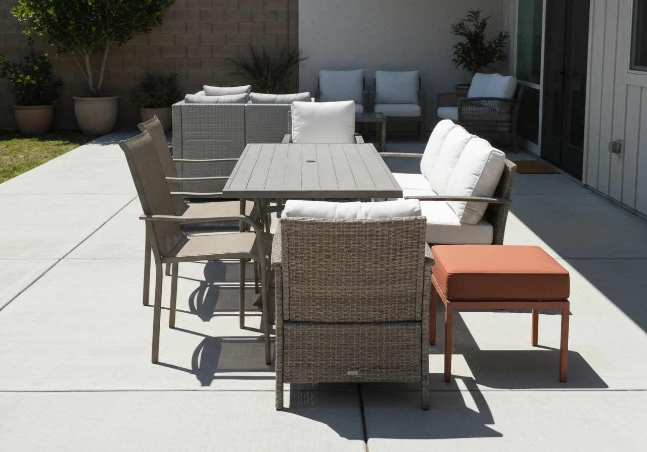
Wicker and all-weather resin wicker
Natural rattan wicker fades and weakens outdoors and should only be used in covered areas. All-weather resin wicker (synthetic PE resin strands woven over a frame) is much more durable but still subject to UV color degradation over years of direct sun. Wicker typically comes in a limited color palette: espresso/brown, honey/tan, gray, and occasionally black or white. Darker wicker tones like espresso tend to fade to a lighter, chalky brown over time. Gray wicker is more stable optically because its faded state looks similar to its original state. From a coordination standpoint, wicker's woven texture is naturally warm and organic, which pairs beautifully with cushions in warm naturals, blues, greens, and coral. Matching with cool, sleek color palettes can work but requires intentional layering to avoid visual conflict between the material's organic texture and a stark modern color scheme.
Composite and high-density polyethylene (HDPE)
HDPE lumber furniture (often marketed as recycled poly or poly lumber) has color baked throughout the material rather than sitting on the surface, which means scratches and weathering don't expose a different-colored underlayer. This is a genuine advantage for color longevity. HDPE typically comes in a range of colors including coastal white, weathered wood mimics, and saturated colors like barn red or adirondack green. The color stability is excellent over time, but HDPE can become very hot to the touch in direct sun, especially in darker colors. In high-heat climates, stick to lighter HDPE colors for any surfaces you'll sit on.
| Material | Color Stability | Heat Retention by Color | Best Color Choices | Watch Out For |
|---|---|---|---|---|
| Powder-coated aluminum | High with AAMA 2604/2605 coatings | Dark colors get very hot | Charcoal, slate gray, warm bronze, white | Fading on dark pigments without quality coatings |
| Natural wood (teak/eucalyptus) | Changes over time (golden to silver) | Low to moderate | Warm neutrals; pairs with most accent colors | UV bleaching without regular sealing |
| Resin wicker (PE) | Moderate; dark tones fade most | Moderate | Gray, honey, espresso | Chalky fading on dark wicker in full sun |
| HDPE composite | Excellent; color goes all the way through | High in dark colors | Coastal white, driftwood gray, natural tones | Hot surfaces in direct sun with dark colors |
How color affects fading, heat, and maintenance over time
The honest truth is that every outdoor furniture color will change to some degree over time. UV radiation is relentless, and even the best coatings and materials show some color shift after several years in direct sun. The question is how much change you'll notice, and how much it will bother you.
Dark colors (matte black, deep charcoal, navy, espresso) show fading most visibly because the contrast between the original saturated pigment and the lighter, chalky faded version is obvious. They also absorb significantly more solar heat. A matte black aluminum chair in direct afternoon sun in a hot climate can reach temperatures well above what's comfortable to touch. If you love dark furniture, prioritize pieces with high-performance coatings rated to AAMA 2604 or better, and look for coating manufacturers who test using standards like ASTM G154, which simulates UV exposure, heat, and moisture cycling in controlled conditions. That kind of third-party accelerated weathering testing gives you actual data, not just a marketing claim.
Light colors (white, cream, light gray, pale blue) show fading less dramatically because they start light and tend to chalk rather than visibly shift hue. But they show dirt, pollen, bird droppings, and water staining more readily, which means more frequent cleaning. In regions with heavy oak pollen, cottonwood fluff, or red clay soil, white furniture becomes a maintenance burden. Medium tones, particularly greige, slate gray, warm taupe, and olive, hit a practical sweet spot: they don't show dirt as aggressively as whites and don't fade as noticeably as darks.
Climate matters enormously here. In coastal environments with salt air, any compromise in coating quality shows up fast as corrosion and color bleed. In desert climates with extreme UV, even good coatings take a beating. In humid Southeast climates, mold and mildew staining on cushion fabrics and chair frames adds a maintenance layer on top of UV fading. Match your color expectations to your actual climate, not to photos taken in a showroom.
Coordinate with cushions, rugs, umbrellas, and planters
Your furniture frame color is the foundation, but textiles and accessories do the styling work. The goal is a layered look that feels cohesive without being matchy-matchy or so complex it becomes a visual jumble.
Start with cushion fabric. For a neutral frame (charcoal, greige, natural wood), you have enormous flexibility. Choose a dominant cushion color that pulls from your surroundings: a blue that echoes your pool, a green that references your landscaping, or a warm white that brightens a shaded space. Then add a second cushion pattern or accent pillow that introduces a second color from the same family. Stick to two or three colors in your textile palette. More than three starts to look chaotic outdoors, where you're already competing with the visual noise of landscaping and sky.
Outdoor rugs anchor a seating area and dramatically affect how color reads in the space. A rug with warm undertones will make cool-toned furniture feel more grounded and livable. A cool-toned rug with a bold pattern can make a neutral furniture set feel intentional and designed. The rug doesn't need to match your cushions exactly; it needs to share at least one color from your palette. If your cushions are a warm terracotta and cream, a rug with terracotta, sand, and a touch of blue will tie the whole area together.
Umbrellas are large color statements. A market umbrella is often the most visible element of a patio from indoors and from a distance. Neutral umbrella colors (natural canvas, greige, charcoal) let your cushions and furniture lead. A colored umbrella (navy, forest green, terracotta) can serve as the accent piece that ties the whole palette together, but it needs to coordinate with your textile colors, not just coexist with them. Avoid picking an umbrella color that introduces a completely new hue not present elsewhere in the space.
Planters and pots are your easiest and cheapest color adjustment tool. Terracotta pots warm up a cool palette. White or black planters keep things modern. Concrete-look pots read neutral and work in almost any scheme. Use planters intentionally as the third color in a two-color palette, rather than as an afterthought.
Small-space and visual weight tricks
Color has real effects on how large or small a patio feels, and getting this wrong in a small space is one of the most common mistakes I see. Dark furniture on a small patio with dark pavers creates a heavy, closed-in feeling. Light furniture on a light floor with light walls can feel washed out and boring. The solution in both cases is intentional contrast.
- On a small patio, choose furniture in a tone that contrasts lightly with your floor color rather than matching or heavily clashing. A warm gray floor pairs well with off-white or natural wood furniture because the gentle contrast creates visual separation without heaviness.
- Use one or two high-contrast accent items (a bold cushion color, a dark planter against a light wall) to draw the eye and create a focal point. This makes a small space feel designed rather than cramped.
- Avoid solid dark furniture in small fully shaded spaces; it visually absorbs light and makes the area feel smaller. Opt for lighter frames and bring in depth through textured cushion fabrics instead.
- In a large open patio, grouping furniture in tonal color clusters rather than distributing mismatched pieces across the space makes the layout feel intentional and proportionate.
- Chairs and tables with open frames (visible through the legs and under the tabletop) visually reduce bulk regardless of color. This matters most in compact spaces where visual weight adds up fast.
- Vertical color elements, like a tall planter in a bold color or a dark umbrella against a light wall, draw the eye upward and make a patio feel taller and more spacious.
Buy smart: swatches, samples, and return policies
This is where most people underinvest in the decision process and end up with buyer's remorse. Outdoor furniture is expensive enough that spending a few extra days testing before buying is always worth it.
If you're buying from a local showroom or outdoor specialty retailer, ask to take a cushion sample or fabric swatch outside. Hold it against your floor material in actual sunlight, ideally at the time of day when you use your patio most. Colors look entirely different under the blue-shifted light of midday sun versus the warm golden light of evening. What reads as a perfect sage green inside under store lighting might look khaki or blue-gray outside. This single step eliminates more regret than anything else.
For furniture frames, ask the retailer or manufacturer specifically about coating ratings. If they're selling powder-coated aluminum, ask whether it meets AAMA 2604 or AAMA 2605 standards. If they can't answer, that's a signal about quality. Reputable manufacturers of quality aluminum furniture will know their coating specs. For very high-sun climates or coastal environments, I'd make AAMA 2605 a hard requirement for dark-colored metal furniture.
For cushion fabrics, look for solution-dyed acrylic (Sunbrella is the most well-known brand, but other manufacturers use similar solution-dyeing processes). In solution-dyed fabrics, the color goes through the entire fiber, not just on the surface, which is why they resist fading far better than screen-printed outdoor fabrics. This matters most for bold or saturated cushion colors. A deep navy or coral cushion in a standard printed fabric will look faded and sad within a season in full sun. The same colors in solution-dyed acrylic will hold for years.
Understand return policies before you buy, especially for large sets purchased online. Some retailers offer a restocking fee on returned furniture, and shipping costs on returns for heavy furniture pieces can be substantial. Where possible, buy cushions and textiles with a try-it window, since these are the elements most likely to look different in your actual space than they did online. Many cushion manufacturers sell replacement cushions separately, which is a useful buying signal: it suggests the product line has some staying power and you won't be stranded if one cushion needs replacing in two years.
Finally, think about longevity in terms of your color commitment. Neutral frames last through multiple design cycles and multiple sets of cushion replacements. Bold or trendy frame colors (a specific shade of terracotta orange, a saturated tropical teal) look fantastic when they're current but can feel dated in three to five years. If you want to express bold color, put it in the cushions and accessories where replacement cost is manageable, and let the frame stay in the background doing its job for the next decade.
FAQ
If my patio has both warm brick and cool gray pavers, what color direction should I choose for furniture frames?
Pick the undertone that matches the larger “dominant” surface area (most visible from seating). If the cool gray pavers visually take up more space, lean cool (charcoal, slate, navy) for frames and warm the look with a terracotta or cream cushion palette, then use planters to echo the brick. If brick dominates, reverse it, cool accents in pillows and rugs keep the palette from becoming overly warm.
What should I do if I really like dark furniture but my patio gets intense afternoon sun?
Use dark only where you sit, not where you’ll touch constantly (for example, dark frames but lighter seat cushions, or dark accents like side tables). Prioritize powder-coated aluminum with AAMA 2605 performance and avoid matte finishes on metal you’ll brush against often, since they can show heat discomfort faster. Also consider shade solutions (umbrellas, pergolas), because even the best coatings cannot change heat absorption.
How can I test cushion or rug colors at home so they look right in my yard lighting?
Bring swatches outside and compare them against your floor and nearby wall surfaces at two times: midday (more blue-shift) and late afternoon or evening (warmer light). If possible, hold fabric against the same distance your furniture will be from you, because color perception changes with viewing distance. Take a quick phone photo in each light condition to compare consistently.
Are white or light-gray outdoor cushions a bad idea?
They are not inherently wrong, but plan for higher stain visibility. White resin frames or light fabric can show pollen, bird spots, and water marks quickly, especially under trees or near sprinklers. If you want the bright look, use a light base with pattern or texture (woven or subtly speckled) and choose removable cushion covers if your lifestyle makes fast cleaning important.
Should I match my outdoor furniture color to my interior furniture?
Not perfectly. Instead, match only the “theme” (warm vs cool, light vs dark) so the transition feels natural. A common approach is neutral outdoor frames (greige, warm white, charcoal) that echo your interior tones, then coordinate with outdoor cues like landscaping greens or patio stone. This prevents the patio from looking like a mismatched waiting room when doors open.
What’s the biggest mistake people make when choosing an umbrella color?
Choosing a color that introduces a hue not already present nearby (in cushions, rugs, planters, or nearby exterior finishes). Also avoid picking only based on the umbrella fabric in a store, because it often reads darker and more saturated outdoors. Choose an umbrella color that shares at least one undertone with your textile palette, then let it be the “accent” rather than the fifth or sixth competing color.
How do I choose between an all-neutral furniture look and a two-accent look?
Use all-neutrals when your yard already provides color (flowers, varied greenery) or when you want easy updates. Use the two-accent approach when your patio is mostly hardscape and you need the color story to come from your furniture textiles. If you go neutral, you must intentionally add texture (woven seat backs, patterned cushions, or layered rug tones) so the space does not feel flat.
Is it smart to buy a fully matching “set” of patio furniture colors?
It can be, but only if you’re prepared for replacement challenges later. Matching collections look cohesive, yet if one piece is damaged or the line gets discontinued, you may struggle to find an exact color match. A safer compromise is neutral frames in the set and let accessories (cushions, rug) provide the coordinated color impact so you can remix later.
If I’m choosing between solution-dyed acrylic cushions and cheaper printed fabrics, how will color change show up over time?
Printed fabrics typically fade from the surface first, so saturated colors like coral or deep navy can quickly turn dull or chalky and look uneven. Solution-dyed acrylic maintains the color through the fiber, so the shift, when it happens, is usually more gradual and uniform. This matters most when your cushions will sit in direct sun for multiple hours daily.
What color choice matters most for durability in coastal areas?
Frame coating quality matters more than the color name itself. Salt air accelerates corrosion and can create color bleed, so for metal furniture look for AAMA 2605 for high-sun or dark finishes, and verify fasteners are stainless steel or properly coated. Even if the color looks right initially, poor coating and fastener materials are where “early” failure often shows up.
How do I avoid making a small patio feel smaller with my color choices?
Avoid extreme contrast between furniture and the floor (for example, dark furniture on dark pavers) because it creates a heavy visual block. Instead, create a softer separation by choosing either lighter furniture on darker floors or mid-tones that blend with the floor while using cushions and rugs to define the seating area. If walls are light and flooring is light, add contrast through a patterned rug and a slightly deeper cushion tone.
When should I prioritize buying replacement cushions instead of investing in bold frame colors?
If you want bold color but don’t want to commit to one look for years, put the expressive colors in cushions, rugs, and umbrellas. Neutral or semi-neutral frames (charcoal, greige, warm white, natural wood tones) usually remain compatible across design cycles, and cushion replacement cost is typically much lower than replacing a whole furniture set. This is especially useful if you like seasonal updates or frequent refreshes.
Next Articles
What Color Patio Furniture Should I Get Today? A Guide
Choose the best patio furniture color for your sun, UV fading, dirt visibility, and your existing outdoor palette.
Best Color for Outdoor Patio Furniture: Top Picks
Best color for outdoor patio furniture with top picks by material, fade and heat tips, and maintenance to keep it lookin
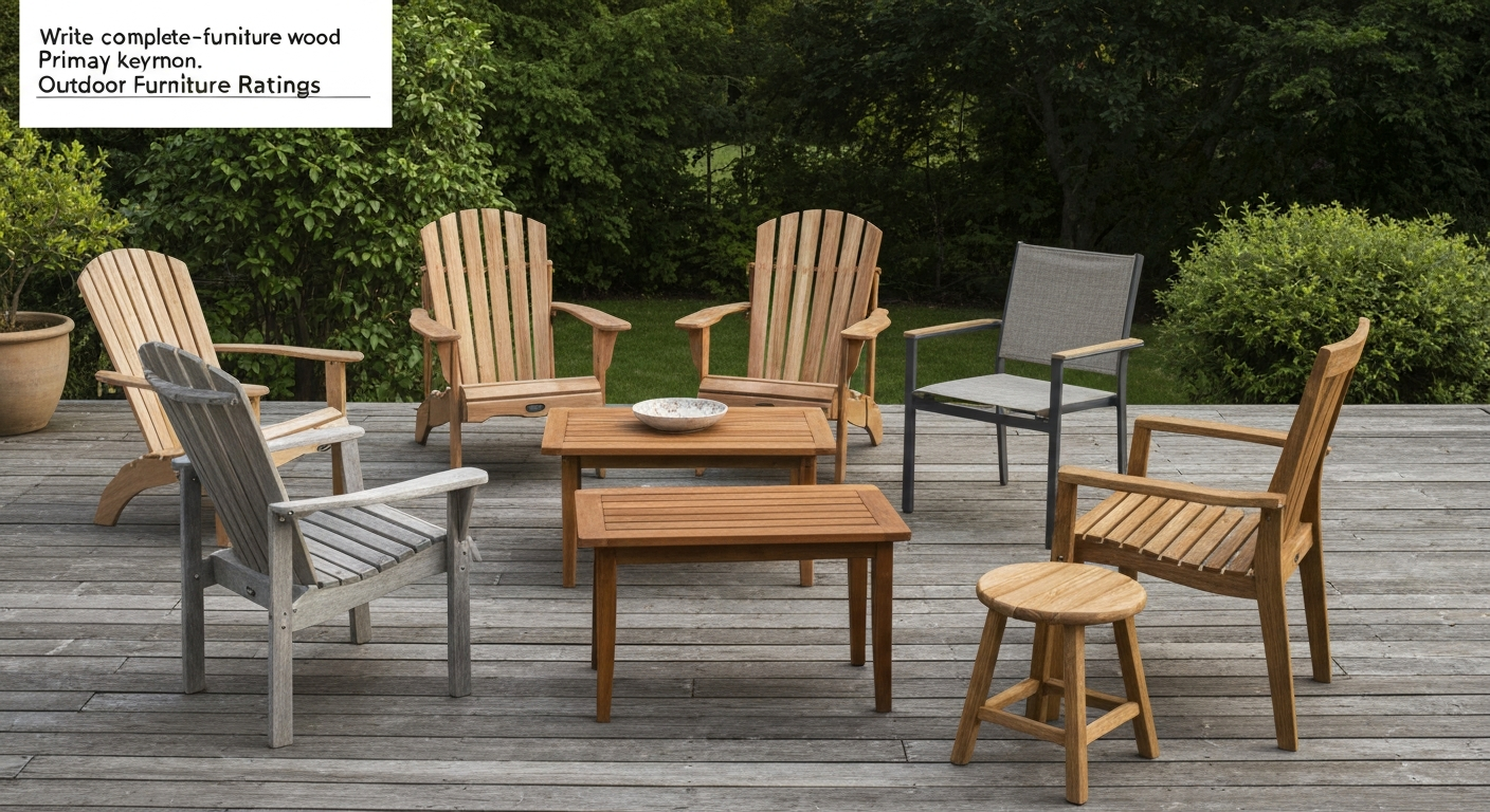
Common Patio Furniture Wood: Best Choices, Care & Tips
Compare common patio furniture wood types, teak, cedar, redwood, oak, with durability, finishes, and care tips.